Behind the lens: Sabbia Co

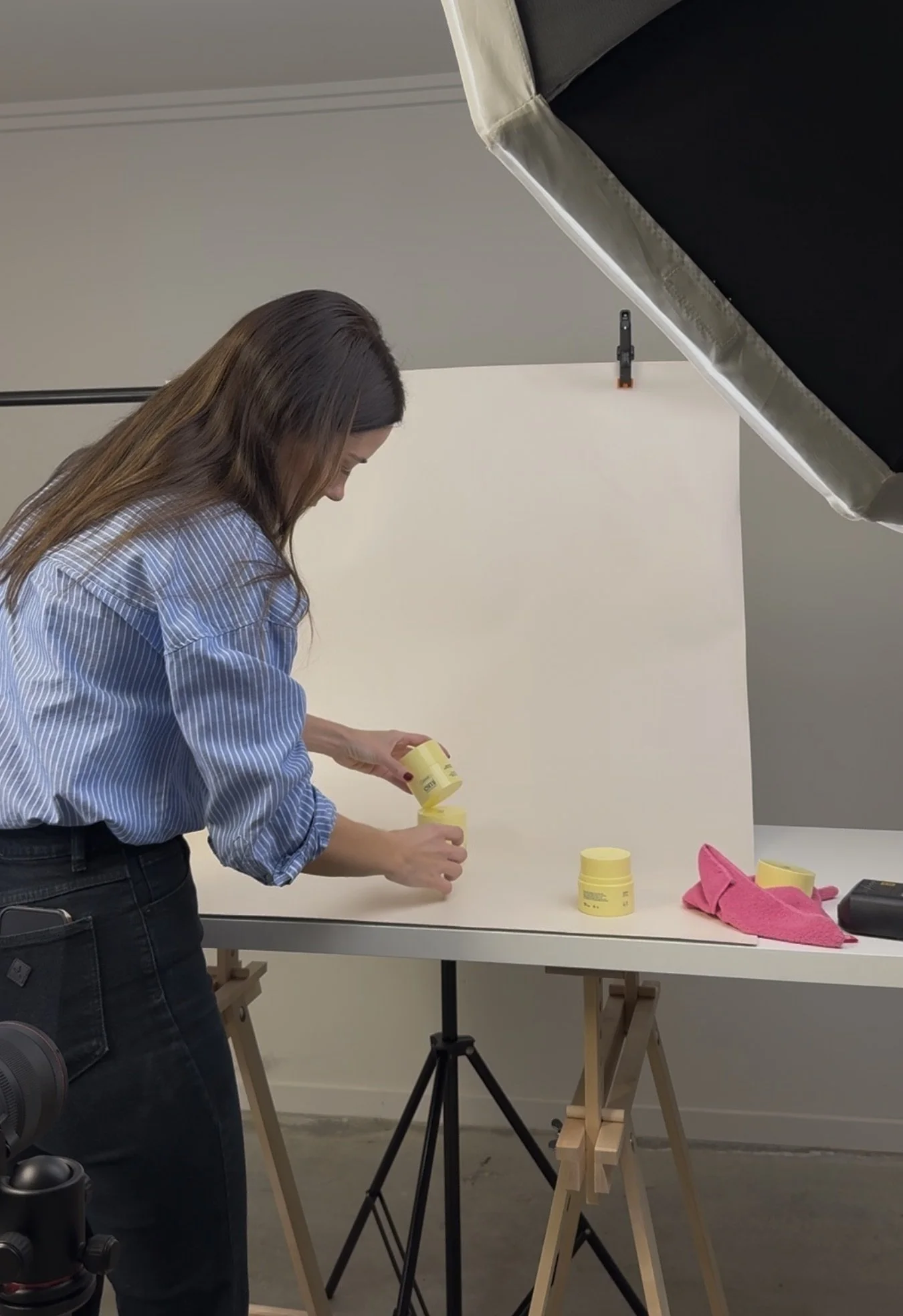
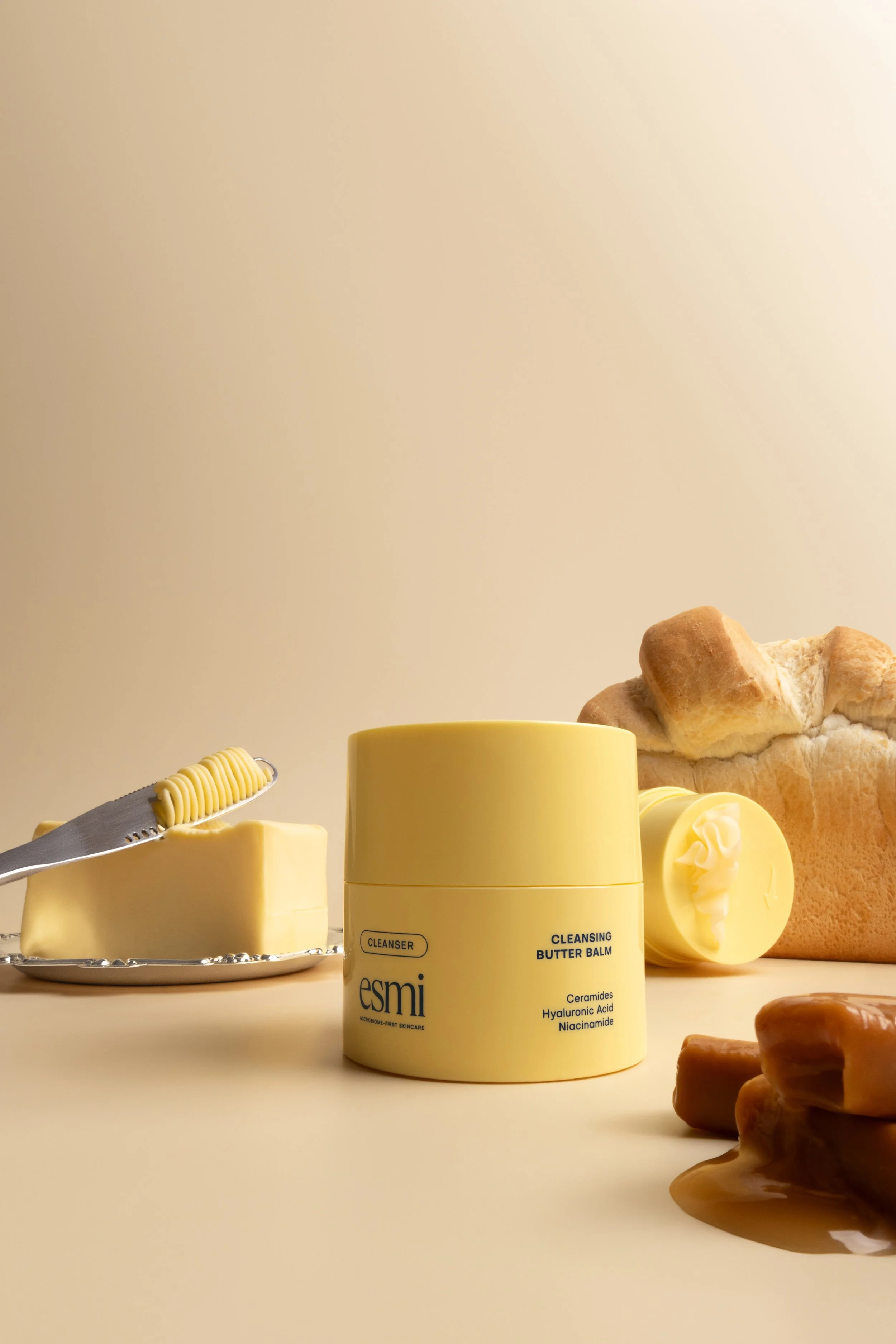
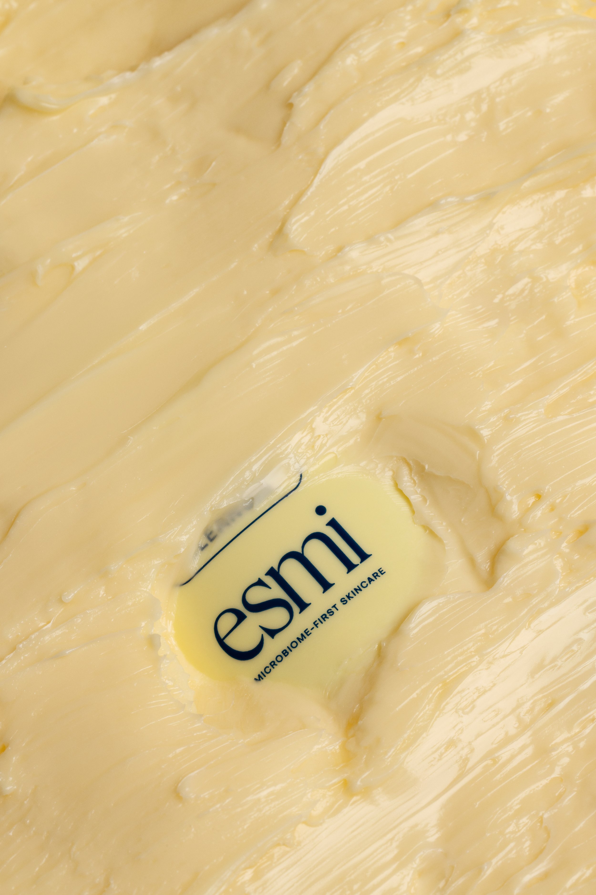
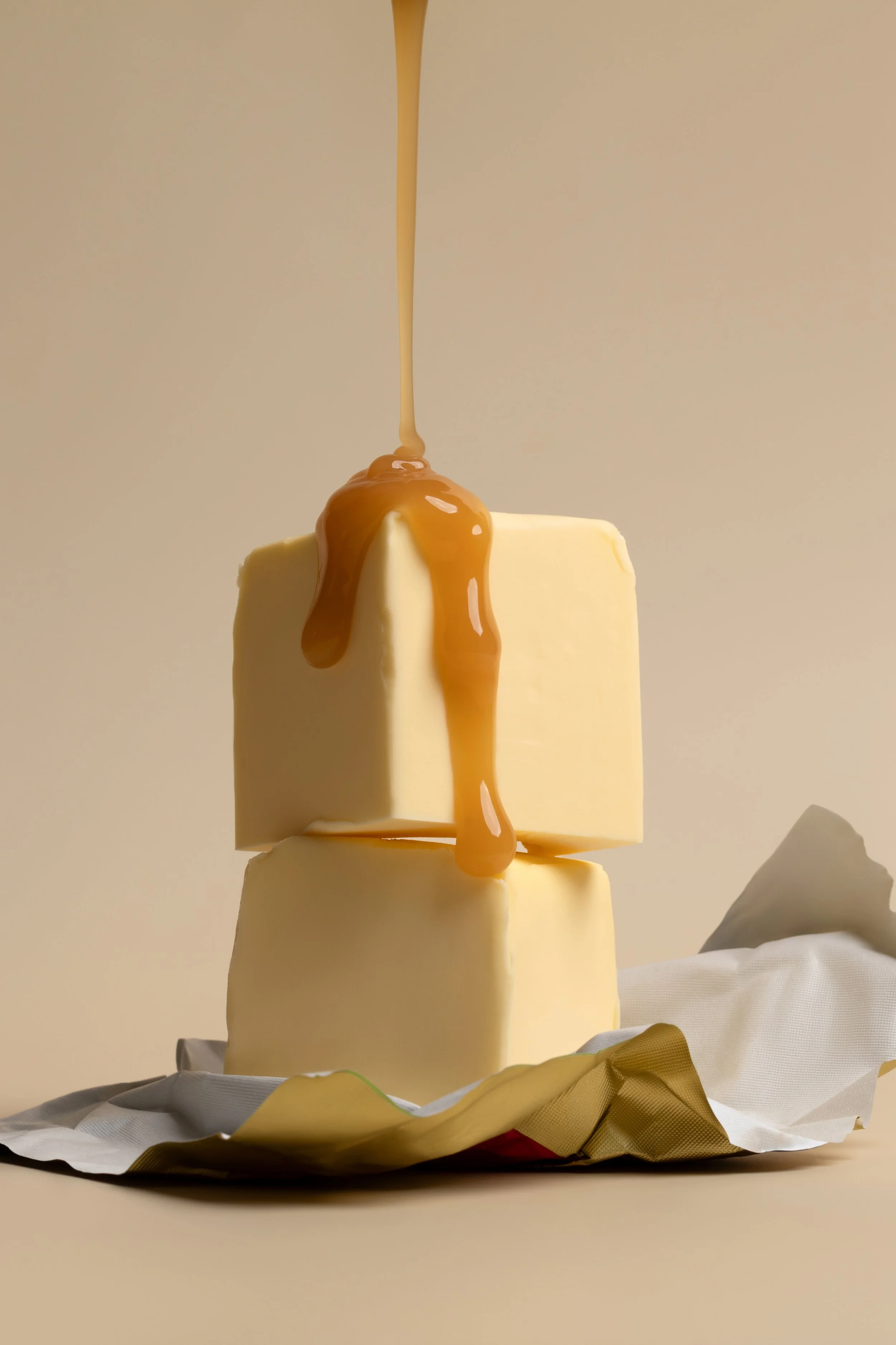
Brief: Texture heavy, minimalist, moody lighting and brand-colour focused.

Service: Full day shoot

Deliverables: 15x product-only images

The aim for this campaign was to update @sabbiaco ‘s current imagery to give their new website and overall brand identity a more elevated feel.

Our past work focused a lot on bright whites, whereas this time we leaned into a moodier look (read: moody, but not SO much that people think they’ve done a complete-brand-180).

I wanted the assets to visually support Sabbia’s mission of uncomplicating skincare, so I kept props minimal, styling simple, and let the textures do the talking.

The result is a clean but sensory-rich collection of images that now feature heavily across paid ads, EDMs, and throughout their new website. The best part? They slot seamlessly into Sabbia’s existing content, proving that when you plan your visuals strategically, previous shoots can keep delivering ROI, while new ones keep you moving forward.

Peep a few of the assets floating around at the moment — they look 10/10.


Imperfection > perfection

I posted a poll last week showing two frames from the same set — one clean, crisp, and what I deemed “campaign-worthy,” the other featuring the mess that was a result of a fumbled serum bottle vs. my beloved $3 shein glass.

What was wild to me? I’d thrown it out as a bit of an off-the-cuff post, yet over 80% of my audience preferred the messy, smashed-glass version (one I’d thought was too left-field to be ‘final gallery worthy’).

It got me thinking —

what does this mean for the future of styled product photography and what will brand visuals look like 6, 12, even 18 months from now?

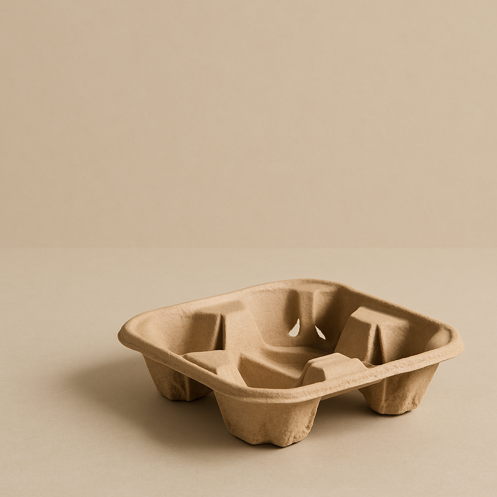
One thing is clear, there’s a shift happening. Brands are becoming more confident in exploring what I’d call intentional imperfection (see; messy sink trend and the ever-iconic coffee trays).

And while the polished, picture-perfect look still has its place (it will forever live on, unapologetically, in the tse. IG grid 😇), like everything in life, it’s about balance.

It’s about using a touch of imperfection as a tool to build connection, without leaning so far in that your brand identity starts to look like an actual mess. No one wants that.

Blur vs Still — Same image. Same styling.
Two very different feelings evoked.

In a nutshell.

The “messy” aesthetic is everywhere. Not just in stylised shoots, but in user- and employee-generated content too. People are craving content that feels less curated and more real, more human.

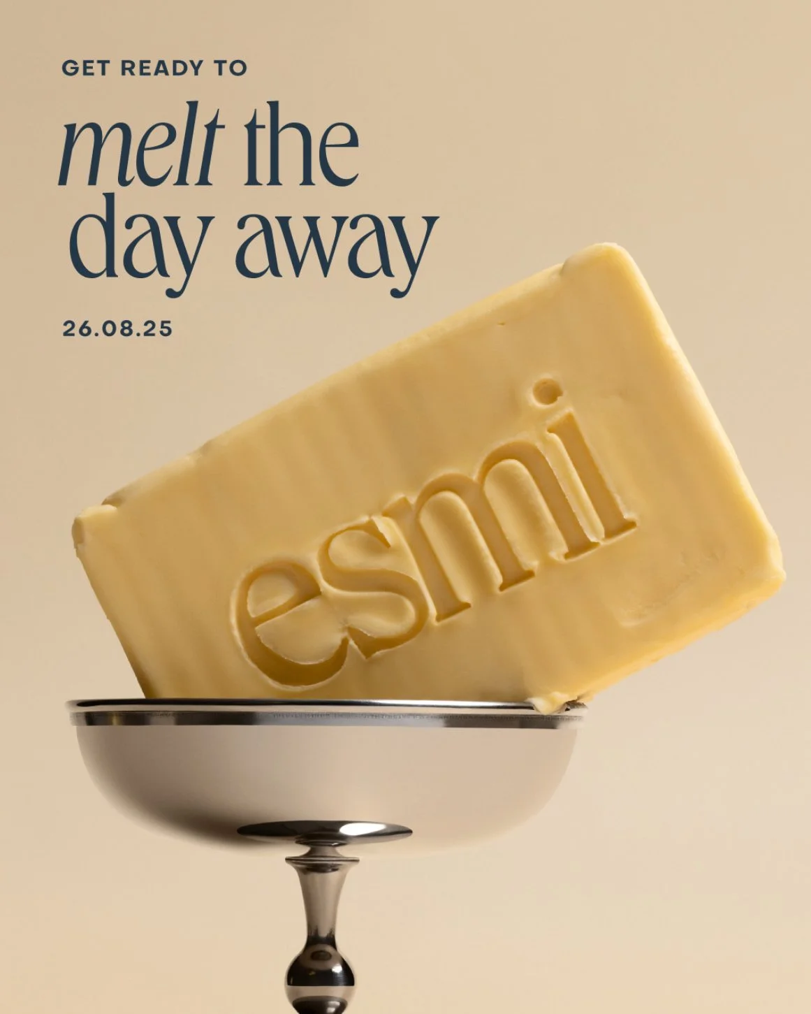
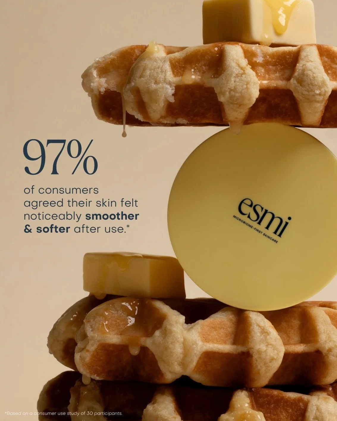
And it’s not always about the literal mess. From my POV, it’s showing up in the visual details too. From added blur (highly requested in client briefs, and always a clear winner with my own audience), to textures of all kinds (it could be your actual product, or your product lathered in butter, just for fun).

All in all: it seems the messier, the more unhinged — the better. After years of chasing perfection as a society, we’re all a little fascinated by things that look less-than-perfect, and THAT’S what is making people stop scrolling.

As someone who’s worked on campaigns that feature both minimal, ad-ready visuals and scenes dripping (literally) with butter, I’d daresay I’m more than qualified to tell you that these galleries are the ones that go the furthest.

love it when a brand is willing to experiment. To explore both ends of the spectrum. The clean and a bit of outside-the-box. That’s where I do my best work. I’m basically a genius at striking that balance (I’m a Libran, IYKYK), creating shot lists that feel strategic, authentic, and relatable as hell.


Behind the lens: ghd Hair

When ghd asked me to create the visuals for their AW25 campaign, I had a bit of a pinch-me moment — as a LOYAL ghd girlie,
this was a serious (!!!) career highlight .

Now if I am best known for anything, it would be my neutrals and simplistic styling, so when I got the brief of 'bold colours and futuristic/AI vibes' - I wont lie I was a bit nervous about whether I could pull it off, but it ended up being, by far, one of my favourite projects yet.

Supporting, Not Replacing: How I'm Using AI in Pre-Production

Like many, I’m an absolute Pinterest fiend. I have the world's most organised boards, and usually, it doesn't fail me. However, lately I’ve been feeling a bit bored with it. I’m seeing the same photos come through, moodboard after moodboard, and things are starting to look a little too the same.

Our Milanote board pre-shoot: I chose to combine AI and Pinterest images as AI is still learning, and some things don’t quite translate yet. Real images still have their place, and in this case, were needed to support/showcase how a wide-angle photo could look.

Recently, I’ve been trialling a bit of a hybrid approach to pre-production by combining Pinterest with a couple of different AI tools, and this campaign felt like the most fitting to really lean in.

I used MidJourney and ChatGPT to create scenes that would best reflect what I was envisioning — something unqiue, but punchy. I didn’t want to just pull whatever was trending, I wanted something perfectly tailored to the brief. I experimented with custom prompts that focused mostly on composition and matching colours as closely as possible to the actual tools — since I was being trusted to flex my creative muscles, I wanted there to be little to no room for surprises come gallery delivery.

(If you caught my recent 7 day series ‘What they wanted vs What they got’ over on socials, you’ll get a closer peek at some of the prompts I used).


MidJourney inspo image: although tools are not exact, it gives a visual example of what to expect

Final image


Keeping with my quest for boldness, I also swapped my usual macro lens for a wide-angle lens. I’ve been loving this style and am so keen to use it more in future work! There’s something about the simplicity and the WOW factor it brings. It really gives the product that larger-than-life energy without relying on heavily styled sets.

I combined the wide-angle with crisp lighting, and almost-prop-less scenes to honour the unique colours of the tools (they were the hero, after all) without the images feeling too over-the-top or gimmicky (which could have happened easily with a brief deemed ‘futuristic’).

This project was such a powerful reminder that stepping outside your comfort zone (whether that’s embracing bold colour or experimenting with new tools) is often where the best creative magic happens.

— Got a bold idea brewing for your brand? Let’s bring it to life.


Behind the lens: The Daily Planner

Last year, Chloe from @thedailyplanner reached out at the beginning of Q2 for help in creating the perfect blend of assets to launch her 2025 collection of teacher planners and accessories.

We kicked things off with a three-month retainer, focusing on the initial stills to launch the main planner collection. We opted for a mix of simple, styled in-studio shots (hello, tse. specialty), some e-commerce images (crucial), and even snuck in a location shoot to give The Daily Planner’s website and IG feed a more cohesive, yet elevated feel.

After the initial retainer, we went on to do three more projects, creating content for the launch of her new stationery accessories range and Prac Teacher Planner collection, along with a video campaign featuring interviews with some gorgeous teachers from across Australia and NZ.
— The goal? To highlight more of the positive aspects of an incredibly tough, yet deeply rewarding job.

click to view the final Why I Teach campaign video.

Over five months, tse. produced 130+ photo and video assets, providing a solid bank of content for Chloe to work with—plus plenty of opportunities for repurposing throughout the year, or until stock sold out (spoiler: it did).

Chloe invested some serious $$ into her launch strategy - and the ROI doesn’t lie.

Sales increased 30% from the previous year just days after the initial collection went live, positioning her brand as one of the top contenders in the world of teacher planners.

Moral of the story?
With a constant stream of premium cohesive content, you get in front of consumer eyeballs quicker and easier.
After all, they can’t buy if they don’t know/can’t see what you’re selling!

— We’re set to kick off preparations for the 2026 range in May and I cannot wait!


The Rise of Multi-Sensory Storytelling in Beauty Photography.

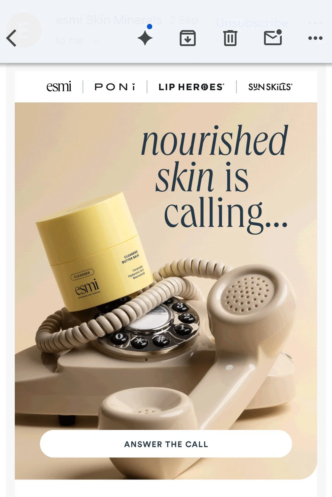
More than ever, we’re seeing beauty and wellness brands taking a leaf out of the food-marketing strategies book, with the use of edible elements to trigger the senses and create a deeper connection with their products.

Here’s how I see this trend shaping the product photography world in 2025:

  • Colour Psychology – it’s nothing new that colour psychology is widely used in marketing and building brand identity, but by ensuring this remains consistent and intentionally placed throughout a brand’s product photography as well as in their branding and packaging, we can craft visuals that not only look good—but stand to evoke more of a feeling in their consumers.

    E.g blacks, whites and grey or nude shades tend to be associated more with more luxurious, high-end or scientific based brands and products whereas colours like greens, beiges and warmer shades tend to convey more of a relaxation, self-care and organic/sustainability-focused feeling.

  • Texture-Driven Visuals – Just like a glossy chocolate drizzle makes a dessert look more indulgent, by combining words we often see used to describe beauty and skincare products, like ‘creamy’ or ‘buttery’, with their food counterparts like ice cream or butter, we can drive that point of interest and appeal more to the sensory side of consumerism.

  • Sensory Attraction Through Food – No longer are we using things like citrus just because a product simply contains that ingredient. We’re now seeing random foods, objects and styled ‘scenes’ used to promote textures, ingredients, and scents in products, helping viewers imagine the smell or feel of a product before experiencing it. And if it’s not doing that — at the very least it’s creating a sense of intrigue as they see a cleanser or face serum seemingly displaced in something like a breakfast scene - a bit out of the ordinary, right?

These approaches create an instinctual attraction to the product. Steven Bartlett talks about this in his book, Diary of a CEO, in that more often than not, people remember weird things over things that look good or simply blend in. Brands like Rhode and Loewe do this brilliantly with their slightly odd compositions and products doused in ice cream or caramel sauce.

Moral of the story?

— don’t be afraid to get weird with your creative briefs, it might just be the thing to make you stand out.